New Look Announcement

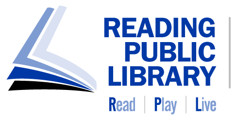
Today we launch a new logo and we’re pretty excited about it. We loved our old logo, and know many of you did, too. And yet, here we are to explain why we decided to move it forward.
Our library has come a long way since its start in 1763. (Yes, we’ve been a part of the city of Reading for 260 years!) We continually evolve to meet the changing needs of our community.
We needed a fresh new look that celebrates the energy and vibrancy of our city, and its people, today. A look that celebrates Diversity and Inclusion, but also stands for Integrity and Dependability, critical in this misinformation age.
Our new identity recognizes our past, but more importantly, it looks to the future of our community.

Our new logo incorporates repeating pages to symbolize the infinite world of stories and ideas from our history, while its movement reaches toward the future.
The shades of blue in our logo embody the values of integrity and dependability that libraries represent. Libraries have always been considered trustworthy places and we proudly carry that legacy forward.
Our new color palette reflects the vibrant city we serve today. Its hues are joyful, warm, enthusiastic, and full of hope, reflecting the warmth and inclusivity that our city stands for and welcoming readers of all ages and backgrounds.

We believe this logo represents not just a visual change, but also a reflection of our commitment to providing a diverse range of resources, fostering a love for reading, and creating a space where everyone feels inspired to learn and connect.
#RPLreimagined #ReadPlayLive
